Seattle International
Branding, Packaging Design, Marketing
Project details
Description
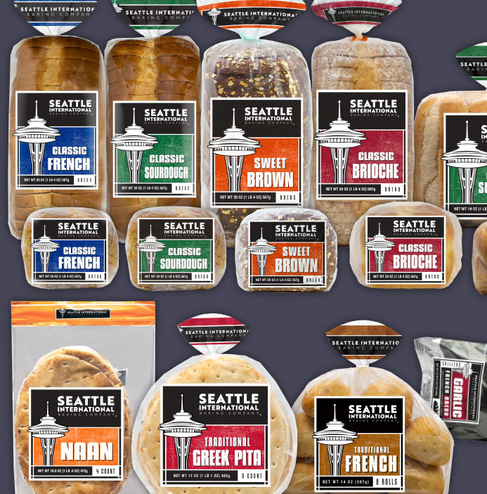
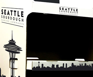
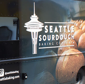
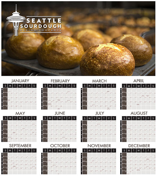
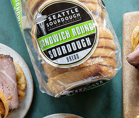
Complete branding redesign for the Seattle International and Seattle Sourdough brands. A legacy brand that needed a refresh through
branding, packaging, and point of sale to modernize the ever growing offerings from this dual brand. In order to not lose loyal customers and gain
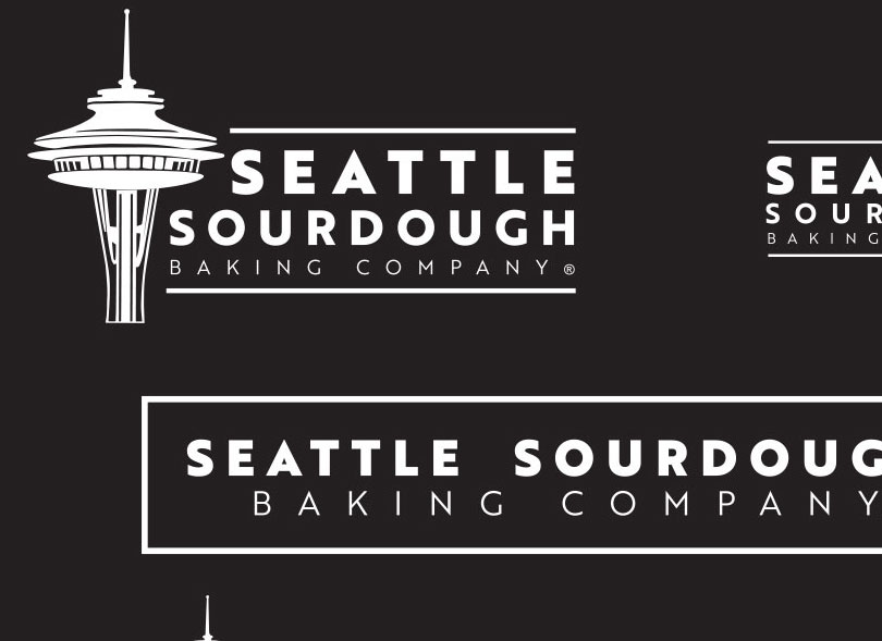
new ones, we first licensed the iconic Seattle space needle for use in the branding. My original concept was designed using only Sharpie markers but
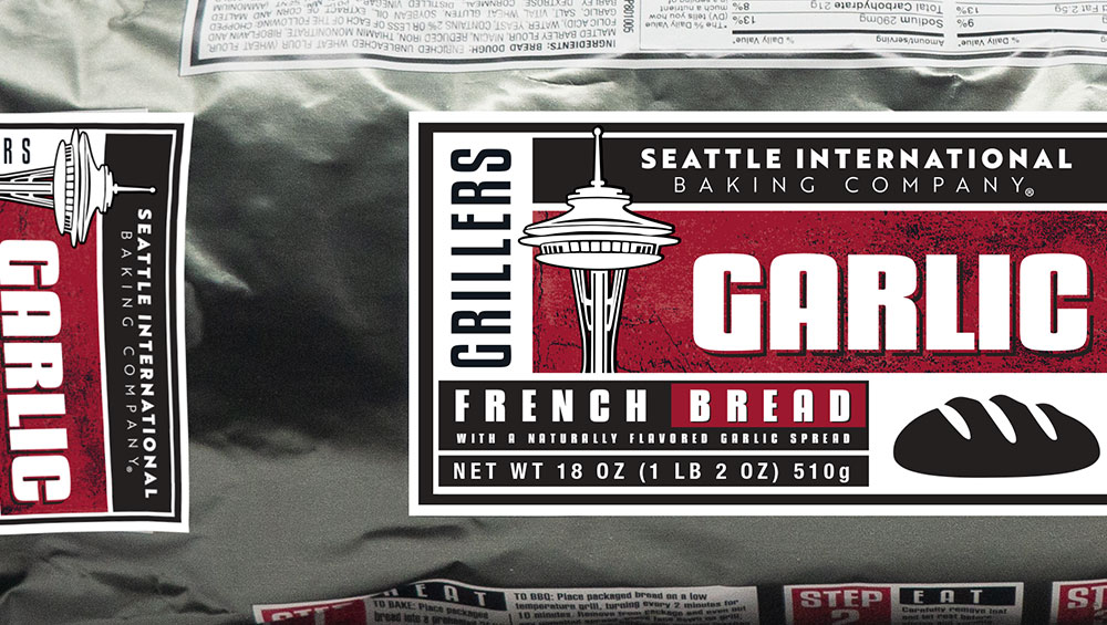
later converted to vector art. The linear design was first implemented on the garlic French bread, which at the time were referred to as "grillers".
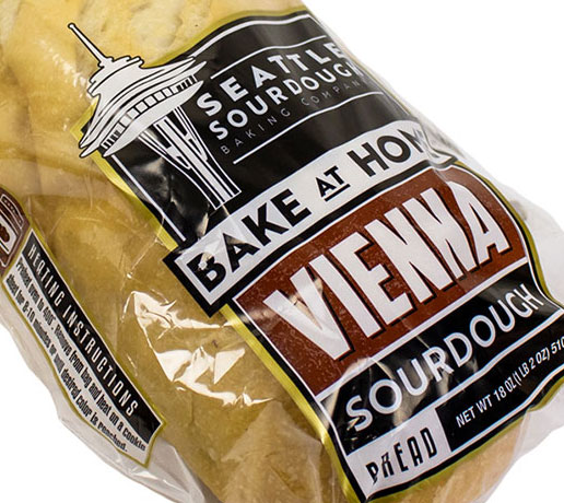
Conceptually I wanted to use a rough background patterm to symbolize something that had been exposed to fire and coals. This "grungy" pattern made
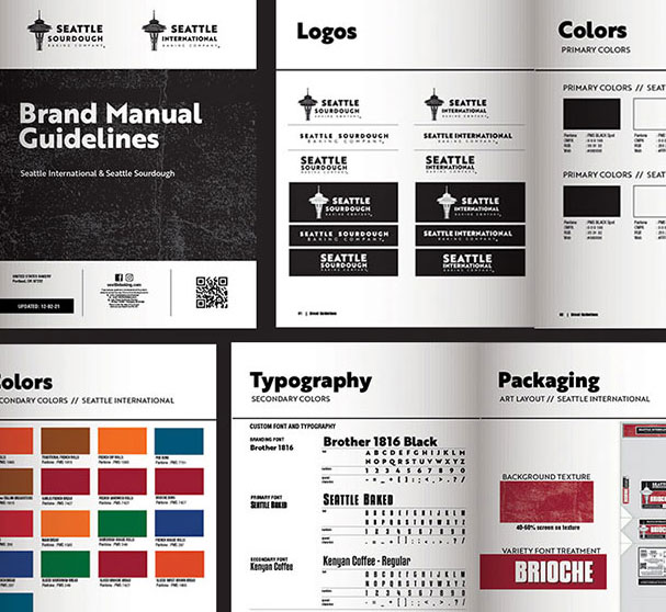
its way onto the variety panels throughout the entire line up. The last peice was the typography. I felt that with this rough yet bold and linear
design, the type had to be reflective. I created a custom font I called "Seattle Baked" that I feel embraces the tough, rustic nature of Seattle
brands. This carries over to displays, ads, and the website.
-
Project Date:
2017 -
Status:
Completed -
Client:
Seattle International -
Location:
Seattle, WA

